


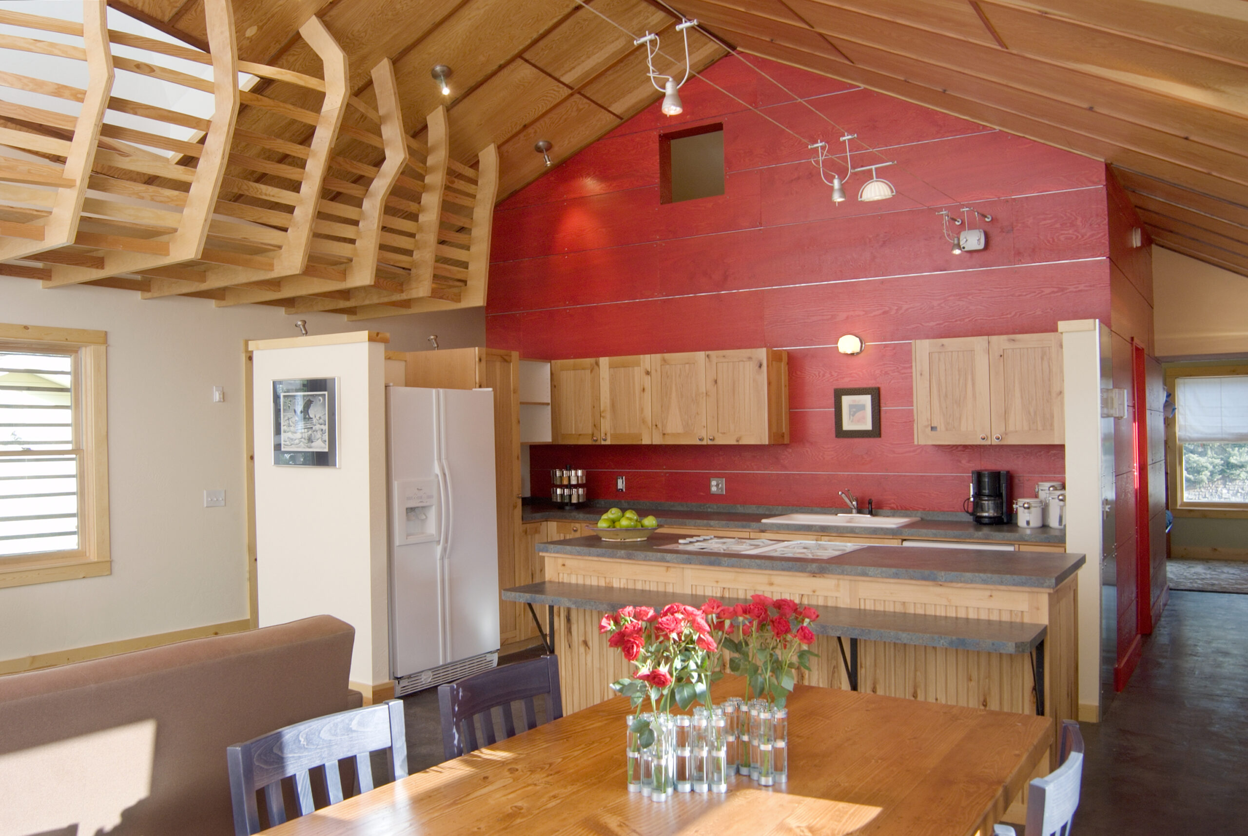
left above image: The kitchen is designed to provide an open, communal space for cooking and dining.
left below image: The windows in the hallway are placed high so that people can’t see inside from the street.
right image: The formal living room adjacent to the dining area provides an adult counterpoint to the play loft above.
© 2005 Shelly Saunders
| Location | Undisclosed |
| Date | 2002–4 |
| Client | Battered women |
| Sponsoring Organization | Women’s Crisis Center |
| Design Team | Christopher Livingston, students of Montana State University School of Architecture |
| Construction | Students of Montana State University School of Architecture |
| Cost | $75,000 |
| Area | 2,000 sq. ft./186 sq. m |
How can a project be both discreet and distinctive? That was the challenge posed to architect Christopher Livingston and his students at Montana State University in designing Shelter 2.
In 2002 a women’s group approached the university about making some repairs and renovations to one of its battered women’s crisis centers, an average-looking home that had been damaged by a water leak. That simple collaboration led to another request: Could the university help expand the shelter itself?
What the students designed and built over the course of a number of semesters was the antithesis of the “everything vanilla” approach that typifies most crisis centers, where efforts to create a safe haven to protect women from their violent spouses often result in purposefully bland structures in undisclosed locations. Rather than trying to have it blend in, Livingston and his students found a way to build a two-bedroom detached dwelling behind the center’s existing residence that was both protective and bold, a place where the architecture reflected the catharsis and healing occurring inside.
“A building can stand out if you don’t know what’s in it. What happens inside is very important, but it’s just a building after all,” explains Livingston of the group’s choice to put, in a sense, a brave face on pain. “If you didn’t know what it was, you’d think it was just a funky apartment. We’d get subcontractors to come over and I would just say, ‘Oh it’s just an apartment for the house,’ and that seemed to work for everyone. And the client was fine with that. From their perspective, having some people in the neighborhood know where it is is actually good for security.”
Other parameters also guided the group’s design choices. The size of the lot dictated a certain footprint. The need for off-street parking to protect residents’ identities meant that the ground-floor garage had to contain as many spaces as possible. Finally, because many women leave violent relationships with their children, the living quarters needed to be flexible enough to accommodate whole families. The most critical concern, however, was privacy. (To protect the shelter’s existing and future occupants, all the students were asked to sign nondisclosure agreements before beginning work. For the same reason, we have chosen to show only the interiors.)
As a result, the finished addition plays an interesting game of peek-a-boo. On the one hand, although the apartment sits back from the street, the distinctive protrusions and roofline of its façade stand out. On the other hand, covered stairs to the second-floor entrance, small windows high enough to obstruct the view of passersby, and a secluded ground-floor entrance safeguard the identities of occupants.
But if the exterior is eccentric, the unit’s interior radiates familiarity. Like a little red barn, the kitchen and common areas are finished with varnished wooden siding. Small nooks, including a computer room, allow residents to escape into semiprivate spaces, while separate hallways lead to two comfortable bedrooms. An organically shaped reading loft that protrudes into the living space is the only reminder of the dwelling’s unconventional exterior.
Although the overall feeling is one of safety and comfort, the apartments are intended only as temporary living quarters—a reality Livingston and his students were mindful of, especially when designing the finishing details of the space. For example, sliding doors on the bedrooms force residents to choose between an exposed closet and a private moment. Like an open suitcase, they serve as a tangible and spiritual reminder of the transitional nature of the space: This not a place to hide, they counsel, but a place to begin again.






READ OR LEAVE A COMMENT